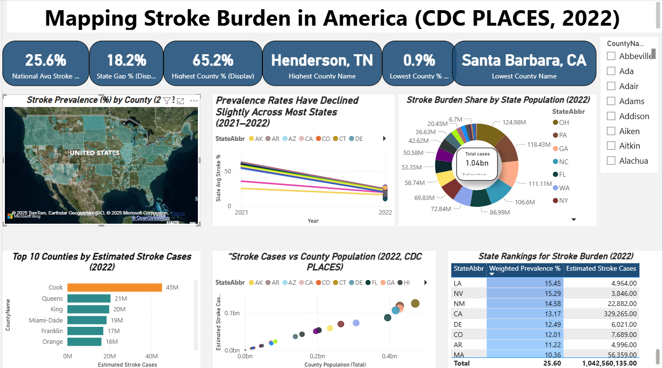
This visualization maps the prevalence of stroke across U.S. counties, highlighting geographic disparities in public health. By identifying high-burden areas, the analysis supports data-driven planning for prevention, resource allocation, and improved healthcare delivery.

I analyzed Chicago’s bike-share trip data using R to compare casual riders and annual members. The study showed that casual riders take longer, leisure-focused trips—often near tourist spots—while members ride more frequently on weekdays for commuting. These insights can help Cyclistic design targeted membership campaigns, boost subscriptions, and promote sustainable urban mobility.
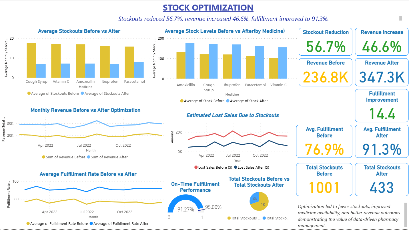
This dashboard highlights the impact of a pharmacy system optimization I designed to improve inventory and supply chain efficiency. The project reduced medicine stockouts by 56.7%, increased revenue by 46.6%, and improved fulfillment rates from 76.9% to 91.3%. It also shows how data-driven insights prevented lost sales and ensured consistent medicine availability for patients.
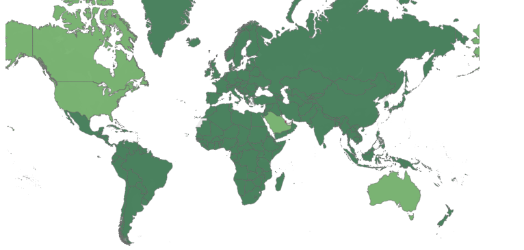
Climate change is one of the most pressing challenges of our time and understanding how countries contribute to global CO₂ emissions is essential for building solutions. To explore this, I created a Tableau dashboard that maps emissions data across the world, allowing us to compare patterns at both regional and global levels. The visualization highlights clear differences between countries. Major economies such as the United States, China, and India emerge as top contributors, while smaller nations and developing regions show far lower emissions. This gap reveals not only the scale of industrialization but also the unequal responsibility different nations carry in addressing climate change. By using an interactive world map, the dashboard makes it easy to see both absolute emissions and relative contributions. For example, while the U.S. and China produce high total emissions, per-capita emissions tell a different story, showing how lifestyles and policies also play a role. Why it matters: This project demonstrates how data can help us understand the urgent issue of climate change in a way that is clear and accessible. Policymakers, organizations, and communities can use insights like these to guide discussions on sustainability, accountability, and future energy strategies.
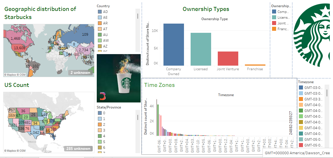
Starbucks has evolved into one of the most recognizable brands worldwide, and my Tableau dashboard explores the data behind its impressive global footprint. The dashboard visualizes store distribution, ownership models, and presence across regions and time zones. It highlights how Starbucks has expanded beyond the United States into key international markets such as China, Japan, and Canada. Within the U.S., it breaks down store counts by state, revealing regional hotspots and areas with slower growth. Another layer of insight comes from analyzing ownership types, showing that licensed stores account for much of Starbucks’ international growth a strategy that allows the brand to adapt to local markets. Time zone analysis further underscores Starbucks’ presence across nearly every major region globally. Together, these insights tell the story of Starbucks’ growth strategy and provide data-driven context for market entry, franchising, and operations management decisions.
Climate change is one of the most pressing challenges of our time and understanding how countries contribute to global CO₂ emissions is essential for building solutions. To explore this, I created a Tableau dashboard that maps emissions data across the world, allowing us to compare patterns at both regional and global levels. The visualization highlights clear differences between countries. Major economies such as the United States, China, and India emerge as top contributors, while smaller nations and developing regions show far lower emissions. This gap reveals not only the scale of industrialization but also the unequal responsibility different nations carry in addressing climate change. By using an interactive world map, the dashboard makes it easy to see both absolute emissions and relative contributions. For example, while the U.S. and China produce high total emissions, per-capita emissions tell a different story, showing how lifestyles and policies also play a role. Why it matters: This project demonstrates how data can help us understand the urgent issue of climate change in a way that is clear and accessible. Policymakers, organizations, and communities can use insights like these to guide discussions on sustainability, accountability, and future energy strategies.